

What’s your first impression when you see any web applications? It’s graphics, isn’t it? The software industry has changed a lot from its innovation, and so has Front-end development. Sometimes, it becomes daunting for front-end web developers to create a responsive design as it continuously evolves. Still, it’s very crucial to stay updated with the latest trends and technologies that are ruling the industry.
Unlike other technology trends, front-end development is unpredictable. So, be aware of what’s cooking in the tech world. Join us on this journey to explore the latest trends and technologies shaping how websites and apps look and feel.
WebAssembly and Beyond: Revolutionizing Browser Capabilities
One stellar player is stealing the spotlight and changing the front-end development game: WebAssembly. It’s a powerhouse that’s revolutionizing the way we experience the web.
- Unleashing Lightning Speeds
Have you ever been annoyed by slow websites? Enter WebAssembly – your digital superhero. It doesn’t just boost speed; we’re talking near-native speed. With WebAssembly, the web becomes a playground for high-performance applications that zip and zoom effortlessly. It’s like your browser just upgraded to superhero status!
- Breaking Free from Browser Limitations
What makes WebAssembly so mind-blowing? It breaks through the traditional limitations of browsers, giving front-end developers the freedom to bring heavy-duty applications to the web. Say goodbye to curiosity, “Do you think that the internet will handle this?” It’s more like, “What incredible thing can I bring to the web today?”
- A New Era of Compatibility
The beauty of WebAssembly lies in its universal appeal. It’s not picking sides; it plays well with everyone. Whether you’re a fan of Chrome, Firefox, Safari, or something else, it doesn’t matter. WebAssembly is here to unite browsers in a harmonious symphony of speed and compatibility.
- The Developer’s Dream Playground
This is like supercharging front-end web developers to create magic on the web. With languages like C, C++, and Rust, there are numerous possibilities to code. Front-end developers can show off their coding skills with WebAssembly, which pushes the limits to create responsive web design.
Jamstack Architecture: Decoupling for Scalability and Efficiency
Jamstack architecture is a new kid on the block, making waves and changing how front-end web developers build applications. It’s here to redefine how we build our responsive web design. Let’s dive into how Jamstack is turning our digital playground into something faster, safer, and just plain awesome.
- Your Website’s BFF
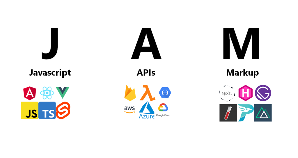
Jamstack is like the best friend your website never knew it needed. It stands for JavaScript, APIs, and Markup, but no need to get bogged down by the tech talk. What it means is a fresh approach to building responsive design websites that’s flexible or, say it, fun!
- Scaling Up Without the Drama
Picture this: your website suddenly goes viral. With Jamstack, there’s no need to panic. Keeping the front and back ends separate lets your site handle more traffic than a summer blockbuster without freezing up. It’s like giving your website a turbo boost for scalability.
- Lightning Speed Performance
Slow websites are so last season. Jamstack uses a Content Delivery Network (CDN) to serve your site lightning-fast. That means your users get what they want quickly – no more twiddling thumbs waiting for pages to load. It’s the need for speed and style.
- Developer’s Dream Toolbox
For front-end web developers, Jamstack is like a magical toolbox. You can pick the tools you love, creating a custom development experience. No more one-size-fits-all solutions; with Jamstack, you’re the captain of your coding ship.
Micro Frontends: Modular Development for Large-Scale Applications
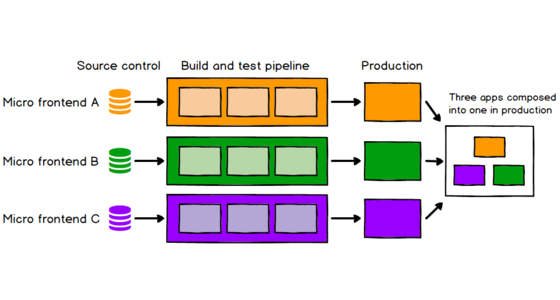
Have you ever heard about Micro Frontends? It might sound fancy, but don’t worry; we’ll break it down in simple terms. Picture this: a team of superheroes working independently on smaller, more manageable tasks to save the day. That’s basically what Micro Frontends do for large-scale applications. Let’s break it down for you about this superhero of development and see how it’s changing the game.
- Tiny Components, Big Impact
Micro Frontends are like having a superhero squad for your website. Instead of dealing with one gigantic chunk of code, it breaks into smaller, more digestible pieces. It’s like assembling a puzzle; each piece does its job, and magic happens when you put them together.
- Flexibility at Its Finest
Have you ever wished you could change one part of your website without worrying about breaking everything else? Micro Frontends make that dream a reality. Because each piece works independently, you can update one feature without sending shockwaves through your entire application. It’s like redecorating your room without having to move the whole house.
- Easier to Manage, Less Headache
Managing a vast application can feel like herding cats. Micro Frontends make it more like taking care of a well-behaved dog. Smaller, modular components mean more accessible updates, quicker fixes, and less stress for everyone involved. It’s the kind of simplicity that front-end web developers dream about.
- Future-Proofing Your Responsive Design Journey
As we look to the future of front-end development, Micro Frontends emerge as a beacon of efficiency. Large-scale applications become less intimidating, and development teams gain the flexibility to evolve and adapt without causing chaos. It’s not just a trend; it’s a more innovative, more sustainable way to build the websites of tomorrow.
Machine Learning at the Front-End: Smart & Personalized Interfaces
Let’s unpack how machine learning is shaking hands with front-end development, making our interfaces more innovative, personalized and delivering that ‘wow’ factor for users.
- Smart Moves for a Smarter Interface
Imagine your website as a friend who knows you so well that it predicts what you want even before you ask. That’s the magic of machine learning at the front end. It studies user behavior, learns preferences, and tailors the interface to make your website feel like it’s reading your mind. Smart, right?
- Personalization, Tailored Just for You
No one-size-fits-all here! Machine learning adds a sprinkle of personalization to the front-end mix. Your website becomes a chameleon, adapting to different users’ tastes and preferences. It’s like having a favorite restaurant already knowing your order when you walk in – but for websites.
- Predicting the Unpredictable
Have you ever had that ‘Aha!’ moment when you found exactly what you were looking for, even though you didn’t know you were looking for it? Machine learning makes those moments happen. It analyzes patterns, predicts user needs, and provides content or suggestions that make you go, “How did it know?” It’s like a partner who knows you inside out to assist with your website.
- User Satisfaction with Steroids
Websites aren’t just pretty faces; they’re tools that should make our lives easier. Machine learning ensures that your website isn’t just good-looking but also functional. From smoother navigation to predicting what users might need next, it’s all about enhancing the overall user experience. Happy users, happy website!
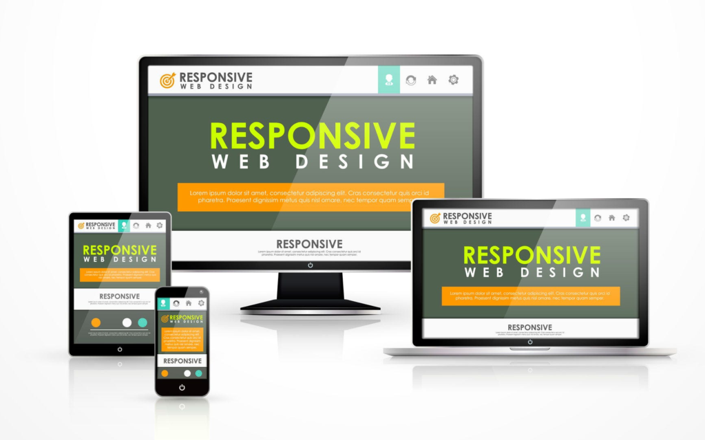
Responsive Web Design Reimagined: Adapting to an Omnichannel World
Let’s explore how responsive web design is not just keeping up with the times but taking center stage in our omnichannel world.
- Goodbye, One-Size-Fits-All
Responsive web design has moved beyond just looking good on phones. It’s now about ensuring your website shines on various devices, from tablets to smart TVs.
- The Omnichannel Dance
In today’s digital dance party, users switch between websites, apps, social media, and email. Responsive design has learned the right moves, providing a consistent and delightful experience across all channels.
- Future-Proofing Your Design
Responsive design is like a chameleon, always ready to adapt to new devices or platforms. It’s not just keeping up with trends; it’s setting them to ensure your website remains fresh and relevant.
- User-Friendly Magic
No more zooming and pinching to read tiny text on your phone. Responsive web design ensures a user-friendly experience, with buttons in the right places, readable text, and an intuitive feel, no matter the device.
Conclusion
As we wrap up this exciting journey, we’ve soared through the skies of WebAssembly, danced to the beats of Jamstack, embraced the modular magic of Micro Frontends, marveled at the intelligence of Machine Learning, and witnessed the evolution of Responsive Web Design into an omnichannel maestro.
At eTraverse, the future isn’t a distant horizon; it’s happening in every pixel and line of code. It’s about creating web experiences that are not just functional but magical – where speed, scalability, and user satisfaction come together in a digital symphony.
The future of front-end development is an open road, and with eTraverse, the possibilities are as vast and exciting as the digital cosmos itself. Here’s to coding the future, one line at a time!